Monday, November 14, 2016

Essie 'Getting Groovy' Winter 2016 Collection Comparisons!


This collection is really growing on me and I have a few ideas on how I want to use some of these colors in some nail art designs! Did you watch my live swatch and review of the entire collection?!
 If you haven't, click on the link below.


Alright now let's get to the comparisons: 

Go With The Flowy- a gorgeous pale dove gray color with silver and blue shimmer/fine glitter. 


I have nothing in my collection that compares to this, so you might want to snag this one! I did want to have a photo with Now and Zen (new from the Essie Fall 2016 collection), just so you could see how much lighter and cooler GWTF is.


Getting Groovy- A gold metallic with yellow gold fine glitter.


While Good As Gold looks like the same color in the bottle, the shimmer in Getting Groovy makes it more of a yellow gold than a white gold. And of course GAG is a metallic with no shimmer. I have to say that I have already used Getting Groovy in some nail art designs (for Chirstmas) and it goes on SO amazingly smooth. I will be picking up a back-up bottle for sure. I LOVE this one so much! I also love GAG. They are both needed for sure!


And here they are close together on the nail. You can see that GAG is more of a white gold. They really aren't the same at all.


Oh Behave!- A mauve pink with a strong gold metallic shimmer.


Well Essie did it again with a unique polish. While this one isn't one that I would naturally gravitate towards, it is growing on me. I did want you to see it next to Eternal Optimist just because if you love that color, than you will most likely love Oh Behave. It seems like OB is EO and with gorgeous gold shimmer added. I have nothing in my collection that compares to this at at all.


Satin Sister- A green toned teal


It was pretty hard to capture the slight difference in these polishes. They all look pretty much the same, but Satin Sister is more green toned than The Perfect Cover-up and CIA. I have heard SS is basically the same as Go Over board (a polish I don't have in my collection). While SS isn't too original, the formula is fantastic if you are looking for a nice winter teal. Just make sure you wear a base coat because it stains slightly.


Here is a close up on the nail. You can see the differences a little better here, but my camera still had a hard time capturing the green tone of this teal.


Party on a Platform- A pink toned red polish with fantastic formula.


Another red...but the formula is great. Pretty much the exact color as Jump in My Jumpsuit and SO many other Essie reds. But, if you are needing to add a red to your collection at the moment, this is a good one!


Ready to Boa- A brown based polish with burgundy and gold metallic shimmer.


I don't have any Essie's like this in my collection. I have heard that Essie Decadent Dish is very close though and I don't have that one. The closest I could find was OPI Muir Muir on the Wall. They aren't the same, but are pretty similar. I also pictured Carry On here because the base colors are very similar and it gives you a good idea of the tone RTB. 


Here you can see the diffences of these two polishes a little closer up. MMOTW has more of a black base and a raspberry and gold shimmer while RTB has more of a brown base with burgundy and gold shimmer. In natural light you can't really see a difference between the two. Both are very gorgeous colors. :)


That's all for comparisons. Are there any you want to add to your collection. What are your overall thoughts about this collection?

-Go Polished


Tuesday, September 6, 2016

Essie Fall 2016 Colleciton Comparisons


I am falling more and more in love with this collection you guys! It's such a great balance of lights and darks, the formulas are great, and most of the colors have just the right amount of dustiness to them. Which I love this time of year. Have you picked any up yet?

I have a full review and live swatches of all six polishes on my YouTube channel. If you haven't see it, click on the link below.


Okay, let's get into the comparisons for each one.

Go Go Geisha- a soft, dusty rose nude polish. It really is a pretty neutral shade. I love it!


Here it is compared to similar polishes in my collection. OPI's Don't Boss Nova Me Around is just about the same color tone (maybe a little more tan), but it's a few shades lighter. I'm Gown for Anything is more purple toned and doesn't have the dustiness that Go Go Geisha has. 


A closer look at the three.


Now and Zen- a dusty gray with a touch of warmth.


Doing this comparison made me realize that I need more gray in my life! These are the only similar shades I have. You can see that CG Intelligence, Integrity & Courage is more cool toned, and Petal Pushers has much more blue (while still being gray). I love the warm tone of Now and Zen on my warmer skin tone. It's beautiful!


A closer look at the two closer shades. You can see the warmth when compared to I,I & C.


Udon Know Me- a dusty and soft dreamy blue. This polish also has a touch of warmth to it. One of my favorites :)


At first I thought it would be very similar to Truth or Flare, but as you can see it's softer and warmer. It's very similar to First View. First View does have a slight shimmer to it and is slightly cooler. 


Here's a closer look at FV and UKM. I personally like UKM better because the warmer tone looks better with my skin tone. They are both beautiful though!


Playing Koi- a warm, rusty and dusty orange. Another one of my favorites from the collection:).


I fell in love the OPI's It's A Piazza Cake last year and thought they might be dupes but... they aren't. Comparing the two together made me push IAPC aside for Playing Koi. It's much richer and slightly more red toned. Well done Essie, this one is SO original! I added Yank My Doodle (which is new this fall too) just so you could see how orange the others are. It also let's you see the mauve tones in Yank My Doodle.


Here's a closer look. Wow! I just love PK SO much. Can't wait to actually wear it!


Maki Me Happy- a slightly dusty red with purple undertones.


Maki Me Happy seemed very close to Gala-Vanting, but Gala-Vanting surprisingly has even more purple undertones when applied to the nail. MMH almost identical to the cult favorite OPI Magnala Wine. While they both have great formulas, they are different. I added Bahama Mama so you can see that all these polishes lean purple, but not as much as BM does.


A closer view of these three. 


Kimono Over- a deep dusty purple. Another of my favorites, it's a great color for fall.


Here it is next to Turn 'n Pose and as you can see it's much darker. It is very, very similar to OPI's Grape Affair. So if you have that one, pull it out this fall!


Here's a closer look at KO and AGA. AGA is slightly brighter and not as dusty, but it's very, very close. In regular indoor light they are identical.


What a great collection! I hope you guys found those comparisons helpful! Let me know what shades you will be wearing this fall. I would love to see how you are going polished! :)

-Go Polished


Tuesday, August 23, 2016

OPI Washington DC Collection Comparisons

I have comparisons for the OPI Washington DC Collection for you! 

If you haven't seen my full review and live swatch video for this entire collection, click on the link below! This video allows you to see the formulas of each polish and their application.


Pale to the Chief- a warm nude polish with a slight silver shimmer pearl with great formula.


The closest nude I have to this by OPI is My Vampire is Buff which is quite a bit lighter. I checked PTTC next to Salmon Sand in the store and the color is almost exactly the same but SS doesn't have that the pearly shimmer like PTTC does. 


Freedom of Peach- a browny peach. Such a unique color. I really love this one!


Comparisons from L to R: Where Did Suzi's Man-go?, Freedom of Peach and Taj Ma Haul. Orange is so hard to photograph, but WDSMG is much more of a true bright orange. TMH9 which just came out this summer) has that same browned out tone.


Here are Freedom of Peach and Taj Ma Haul together on the nails. They are pretty much identical FOP is just a touch darker. TMH has a thicker formula (that is easy to work with) and FOP is more of a crelly. Both are opaque in two easy coats. Can't lose with either one. :) Can't wait to wear this one this fall.


Never a Dulles Moment- a toned down mustard shade. (It shows up much brighter in pictures). A favorite of mine.


Here it is compared to I Just Can't Cope-acabana (left).


 And here is a better comparison on the nails. You can really see the mustard shade when compared to IJCC. Yellow isn't a favorite polish color for me, but this is one I will certainly wear. So pretty!


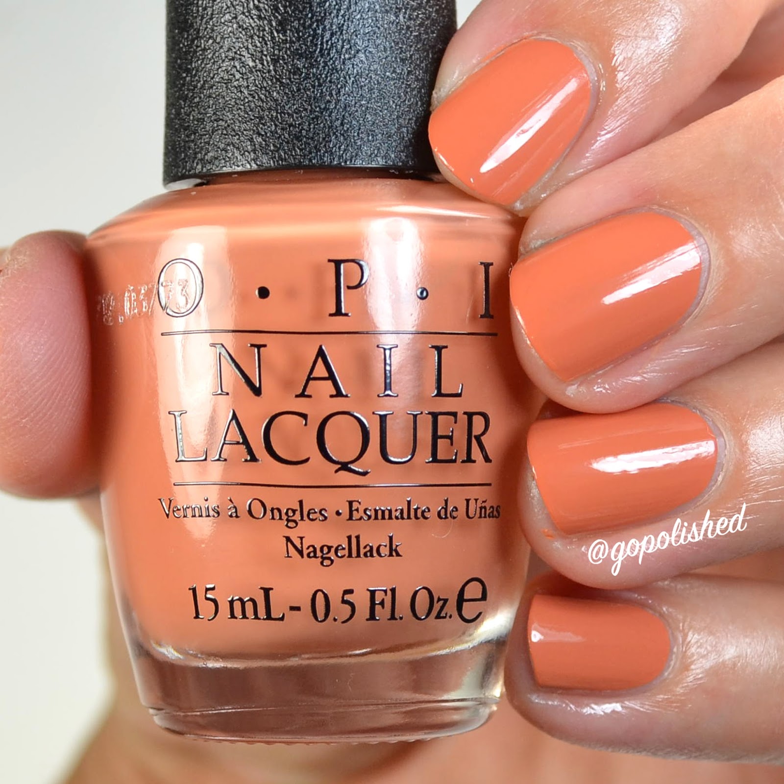
Yank My Doodle- a browny orange mauve. No other way to explain this one except unique and gorgeous! One of my favorites from the collection.


The only polish I had that came close to Yank My Doodle is Gouda Gouda Two Shoes. They definitely share the same color tone, but YMD is a few shades darker. GGTS also has some copper shimmer and YMD is a straight up creme. 


Squeaker of the House- a creamy chocolate brown. One of my favorite type of shades. Why do I love browns so much? Anyone else with me?!


Have you seen this shade before by OPI? Yes you have, at least one that's very, very close. You Don't Know Jacques (a cult favorite) is a touch darker and a touch more cool toned. (Basically the same though)


Close up you can really see the very slight difference. While both apply well, they do have different formulas, YDKJ is a crelly and SOTH is a true creme. 


Madame President- a bright raspberry shade with impeccable formula.


Comparisons from L to R: She's a Bad Muffaletta, Madame President and Essie Raspberry. It's much more purple toned than the newly released SABM and not quite as purple toned as Raspberry (but close). I compared it to other OPI's in the store which I don't have and it came closestest to Koala Berry, but they still aren't exact. Really though, a color this shade isn't too unique or too hard to find. But, this one has exceptional formula!


Here we are taking a closer look with it next to Essie's Raspberry. I love both!


OPI By Popular Vote- a cooler toned dusty berry shade with exceptional formula.


When looking at the colors in the bottles, this one looks super close to the one just below (We the Female), but WTF dries down a touch darker. 

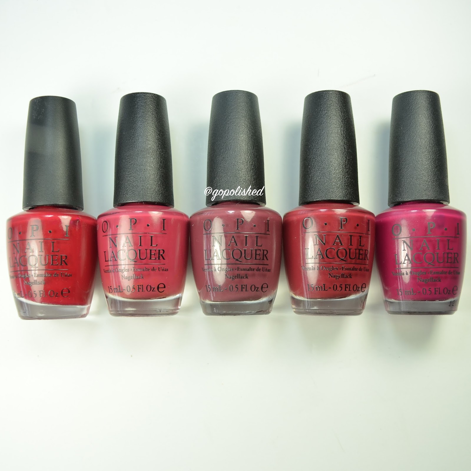
We The Female- a rich but dusty burgundy shade with perfect formula.


Comparisons from L to R: OPI By Popular Vote, Just Lanai-ing Around and We The Female. I was surprised to find that I didn't have any polishes close to these. I have berry shades, but not ones with the dusty quality these both share, which made me love them even more. So pretty!


I added a few berry shades I have to the ends so you can see the comparisons. On the very left is All I Want For Christmas (is OPI) and on the very right is Miami Beet. Obviously not even close. Love the dustiness of the new berry colors!


CIA= Color is Awesome- A gorgeous dusky blue teal with fantastic formula.


It really isn't too hard to find a color like this one in any nail polish line. It is a very pretty shade though. Here it is compared to Couture Covet by CND (one of my favorite fall picks from last year). CIA has a much better formula in my opinion. And Essie's The Perfect Cover Up is just slightly dustier. I don't have Ski Teal We Drop, but I imagine it's pretty close to that previously released polish from OPI.


Stay Off the Lawn- a dusky teal green with fantastic formula. Another one of my favorites from the collection.


I thought for sure it was exactly the same as Amazon...Amazoff, one of my favorite shades. As you can see Stay Off the Lawn is more green toned and AA is more blue toned. They are pretty close though.


And with a closer look you can see that they are the same shade with a slightly different color tone. I think I like SOTL better and it seems to stain less than AA. (Although they both have the potential to stain.)


Suzi- The First Lady of Nails- A dusty swampy green with fantastic formula. I love, love, love this one! Ugh I want to wear it right now! Definitely a favorite of mine, but I do love green :).


Comparisons from L to R: Uh-Oh Roll Down the Window, Suzi-The First Lady of Nails and Zoya Hunter. STFLON has the same color tone of UORDTW but is much darker. And, it is much more yellow toned than Hunter. 


Close up of these two together. Gorgeous!


Shh...It's Top Secret- a rich dark brown with fantastic formula. Another favorite of mine.


If you have stuck with me for a while you know I love How Great is Your Dane (left) and it's the perfect dark brown, but look how light it looks compared to SITS. Wow.


Here they are close up and I added in Lincoln Park After Dark which is richer (almost black) and has more of a purple undertone. I will take them all please :).


*Special Edition Polishes*

"Liv" In The Gray- a dark gray with a slight green undertone with fantastic formula.


It's not too hard to find a polish this shade either. I do love that it has a slight green tone to it which you can see compared to Strong Coal-ition.


Kerry Washington- a bright rich plum with fantastic formula.


Comparison from L to R: Kerry Washington and Skating on Thin Iceland. While SOTI has a slightly cooler tone, they are pretty much dupes. If you don't have a color this shade pick up KW, the formula is better, which is hard to believe because SOTI has a pretty great formula too.


A closer look.


Inside the ISABELLEtway- a caramel creme with fantastic formula.


It's very close to ZOYA's Chanelle but more warm toned. In 2014 I choose Chanelle over OPI's Ice-bergers and Fries (from the Nordic collection), so I imagine ITI is very close to that OPI polish.


Whew that's a lot of polishes and I can honestly say I love all of them with the exception of the nude shade. (I am pretty picky when it comes to nude polish). Which ones do you think you might pick up? I would love to know! I don't think you can go wrong with any of them.

-Go Polished